Good content becomes essential when it comes to promoting a brand. But good content, properly crafted from an aesthetic point of view, this is King!
Composition, hierarchy of information, judicious selection of colors, and a lot, a lot of creativity are the basis for good design, and consequently for success. Among so much information that enters us every day through our eyes, only what really excels in quality manages to score points and make itself noticed.
Therefore, we leave here good examples of who makes the King content.
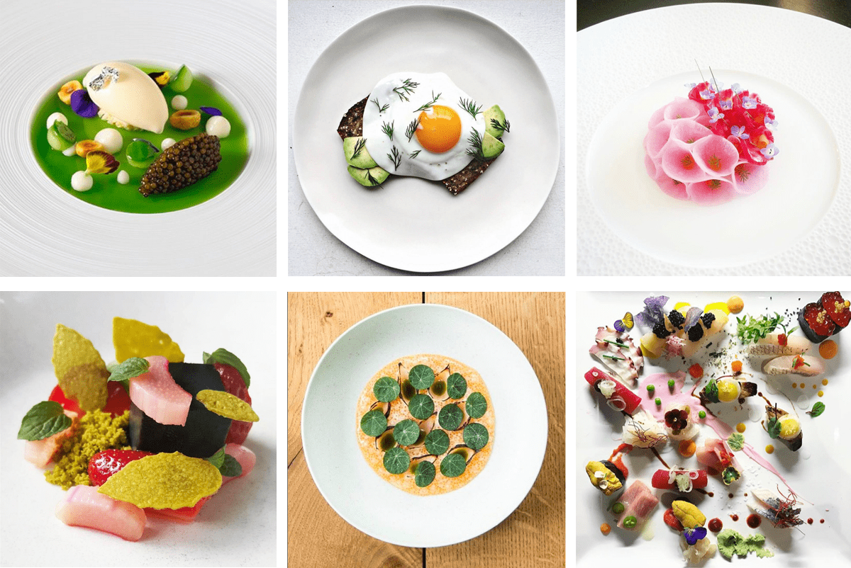
Because a meal can be much more than meeting a basic need. Design, good taste and appreciation for beauty transform any meal into a sensory experience that goes far beyond the palate.


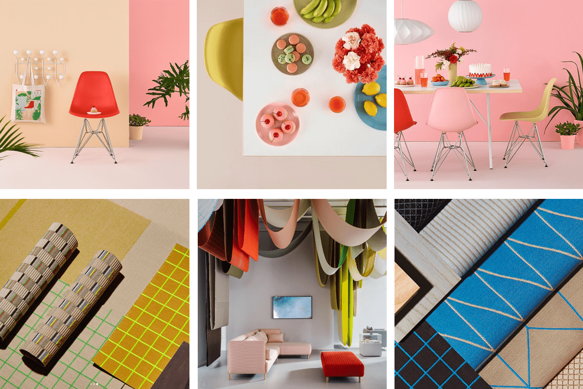
Furniture with delicate lines, studied textures and an exemplary color palette. Once again, the quality of the design and the attention to detail allow a chair to stop being just a chair.
And if the chair is no longer just a chair, then the brand it represents is no longer just a brand. It’s the brand!


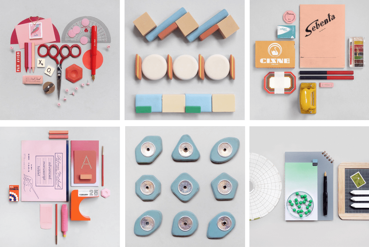
They sell stationery that could be boring / common (and actually it is) but here comes a trained eye that doesn’t leave the composition in the hands of others. The pens, erasers and brushes combine and create patterns that make them the kings of the party. The boring becomes unique, and the content produced makes this brand a must have.


